Logo Design
Client: Climax Aesthetic Surgery
For the Climax Aesthetic Surgery logo, I focused on creating a mark that communicates precision, balance, and confidence—qualities that define Dr. Ojo’s approach to aesthetic surgery. I used soft, symmetrical forms to reference the body and natural contours without being literal, keeping the design clean and modern. The color palette and typography were selected to feel feminine but restrained, avoiding anything overly decorative while still conveying warmth and trust. The result is a versatile, professional identity that aligns with the level of care and services offered at Climax.
![]()
Client: StarFire Festival
For StarFire Festival, I developed a logo that feels energetic and dynamic to match the cosplay, video game, and music blend of the event. I leaned into bold, graphic shapes and a superhero-inspired aesthetic to reflect excitement and fandom culture, while keeping the mark readable and scalable across posters, shirts, and signage.
![]()
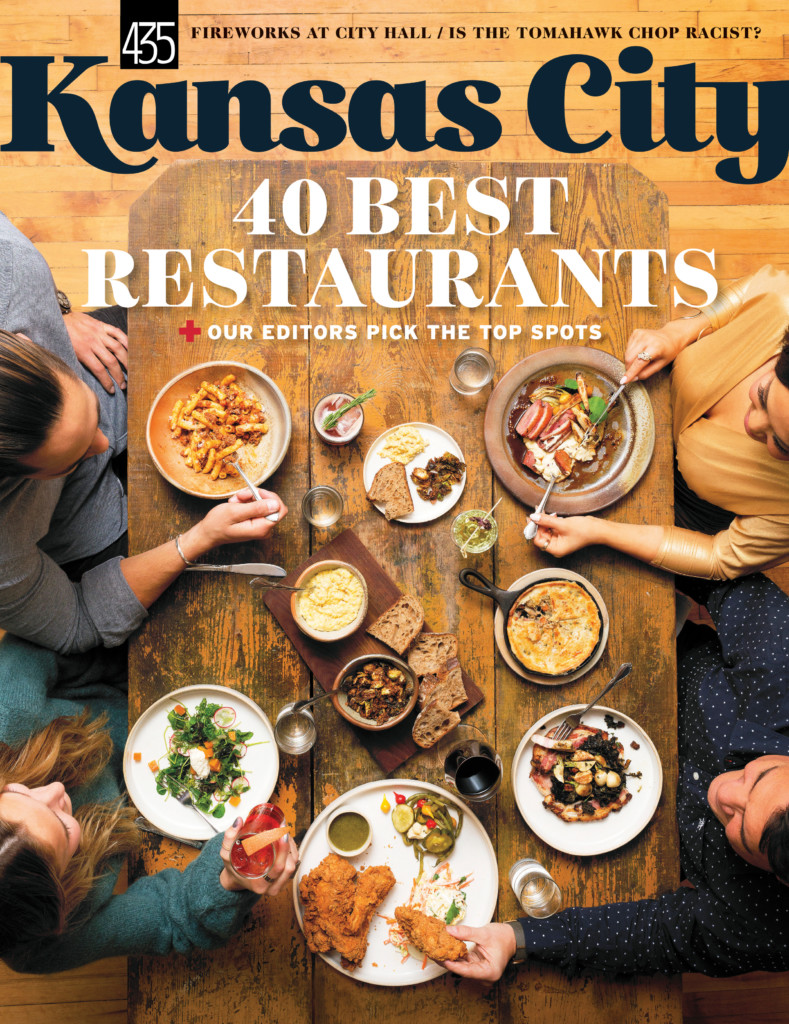
Client: Kansas City Magazine
I refreshed the Kansas City Magazine logo by augmenting and stylizing the type to create a unique masthead. The treatment gives the wordmark more presence and personality while maintaining clarity and flexibility for both print and digital use.
![]()
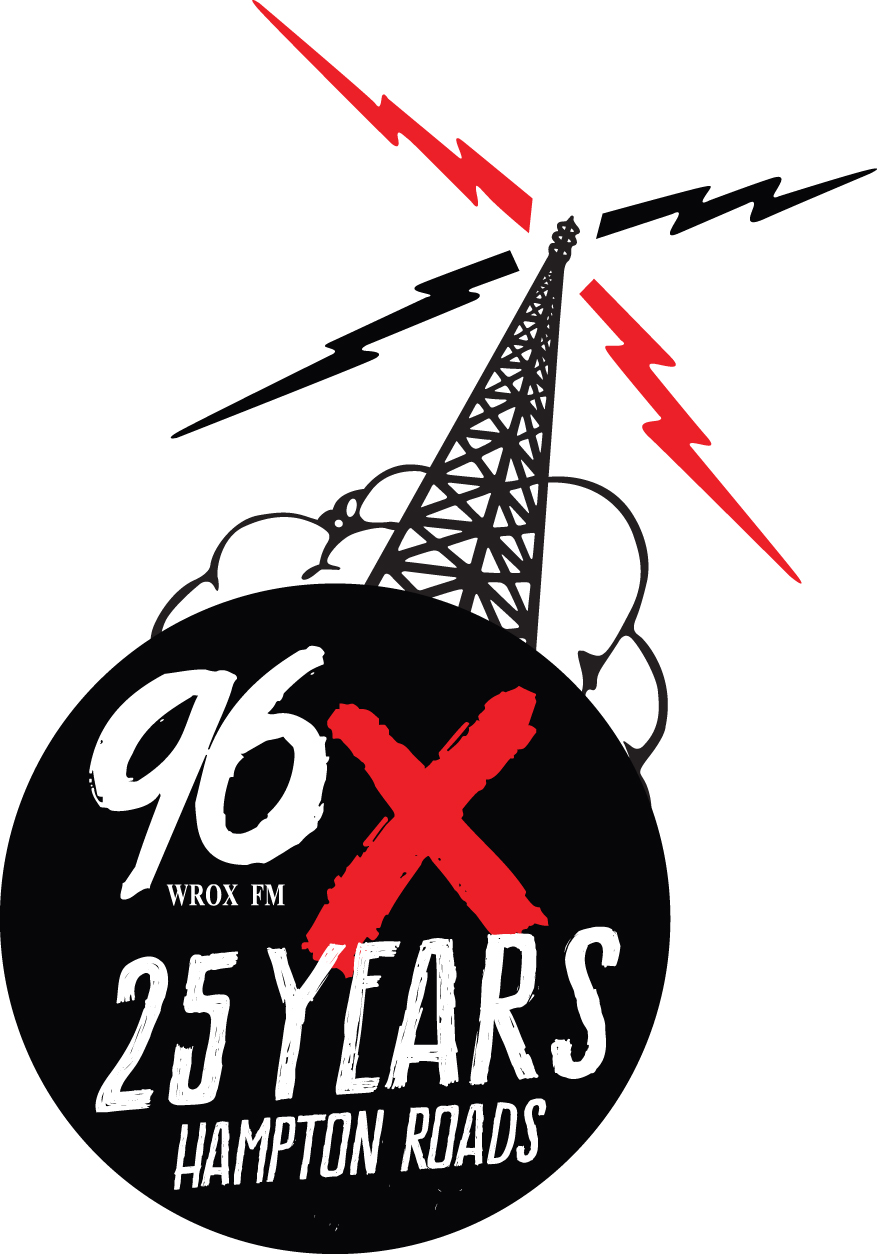
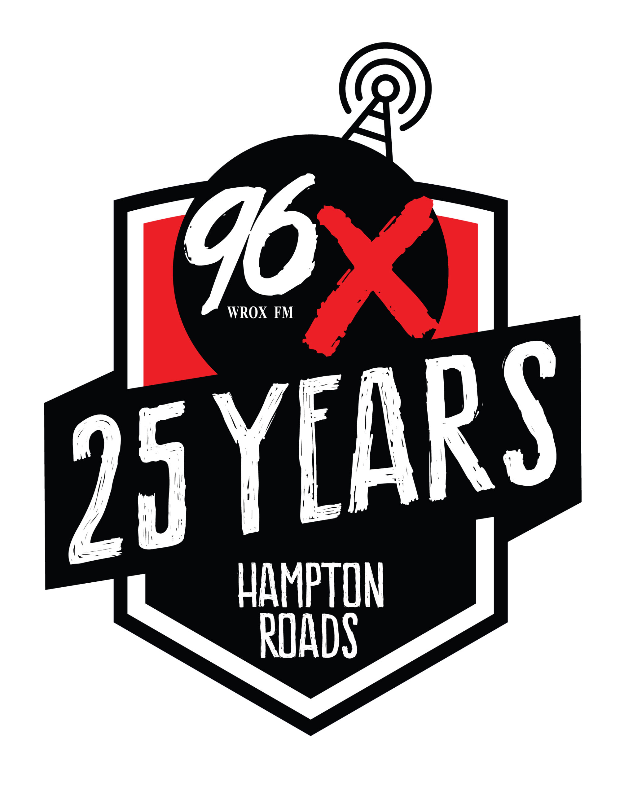
Client: 96X FM
For the 96X FM 25th anniversary logo, I designed several options that felt true to the alternative rock station’s identity — gritty, bold, and a bit edgy. Each version balanced radio heritage with a celebratory feel, ensuring the mark worked on air, on merch, and across promotions.
![]()
Client: Droofin | Heartwork Marketing
With Droofin’s redesign, I pushed away from the original sterile look toward a visual system grounded in the brand’s personality. Drawing from craft beer traditions and vintage pub signage, I explored options that referenced the Scottish name and delivery service roots, ultimately landing on a logo with character and warmth.
Their previous logo:
![]()
Their new logo I designed:
![]()
My original logo offerings before the final tweaks:
![]()
![]()
![]() Client: Belmont Eatery
Client: Belmont Eatery
For Belmont Eatery, I created a logo that reflects the historic nature of the space and its handmade menu focus. Using a slightly retro, simple style aligned with the client’s color palette, the mark communicates authenticity and craft, and ties directly into the restaurant’s visual identity.
![]()
![]()
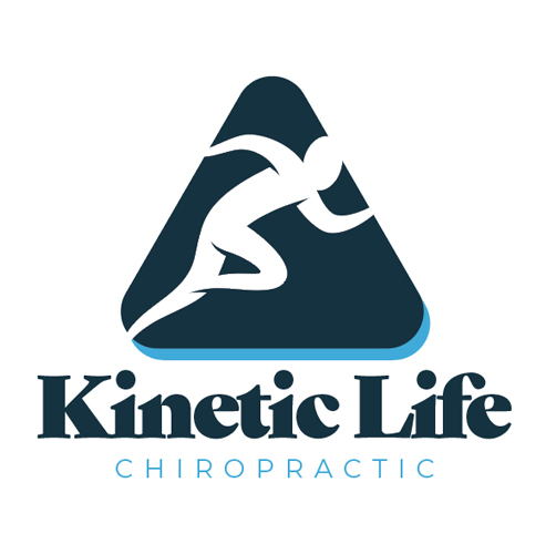
Client: Kinetic Life Chiropractic
The Kinetic Life Chiropractic logo was built around a triangle symbolizing the triad of health (structural, chemical, emotional). I paired that with active, dynamic forms to suggest movement and functional wellness, delivering a mark that feels balanced, purposeful, and relevant to the client’s holistic approach.
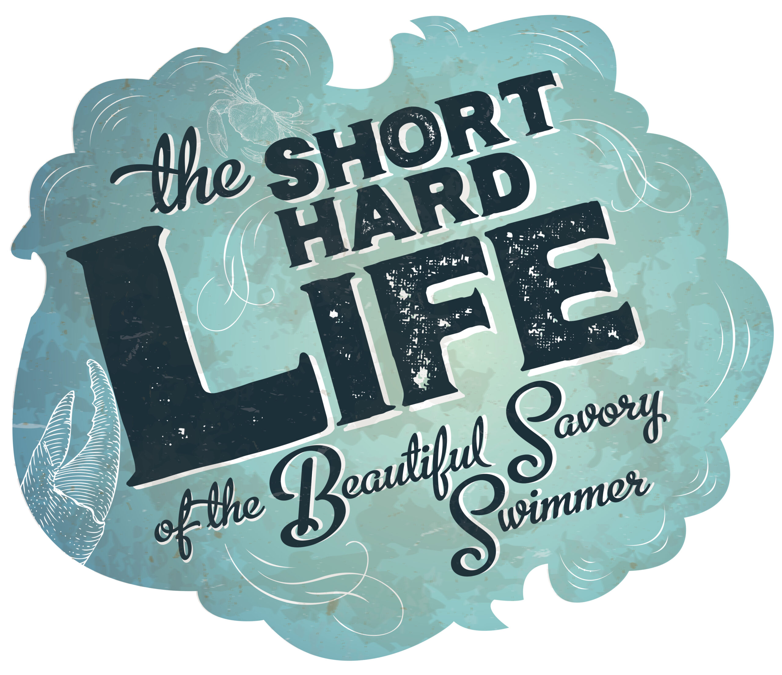
Client: Distinction Magazine
For this editorial logo/headline treatment, I augmented type and illustrations to visually support content about crabs and crabbers. The approach strengthens the article’s character while staying grounded in editorial design and typographic hierarchy.
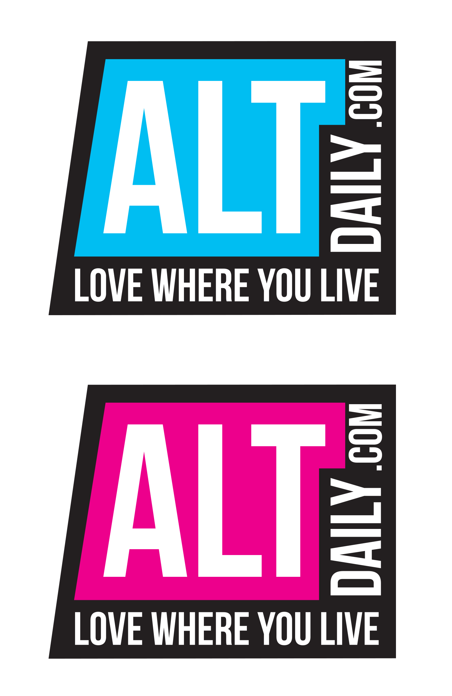
Client: AltDaily
With AltDaily, I aimed for a simple, modern logo that still had an artsy edge suitable for an online arts and entertainment zine. The form is clean and flexible, reinforcing the publication’s content focus while maintaining visual clarity.
Client: Legends of the Fly
For Legends of the Fly, I developed a logo rooted in fishing heritage, basing the design on a fly reel and lure. The mark bridges the technical aspects of fly fishing with a recognizable silhouette that works on apparel, print, and digital.
![]()
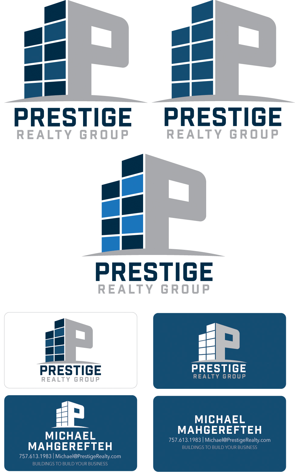
Client: Prestige Realty
This logo was crafted to feel clean, professional, and distinct within commercial real estate. I incorporated a hint of a building into the “P” of the wordmark to subtly convey property and industry context while keeping the type refined and business-appropriate.
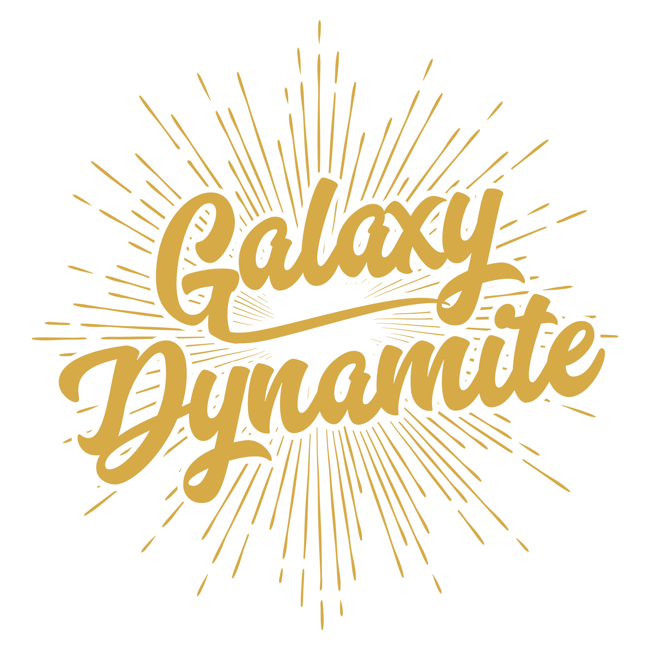
Client: Galaxy Dynamite
For Galaxy Dynamite, I updated and augmented type to create a logo that works as both a band identity and merch graphic. The treatment plays with bold forms and energy appropriate for music branding.
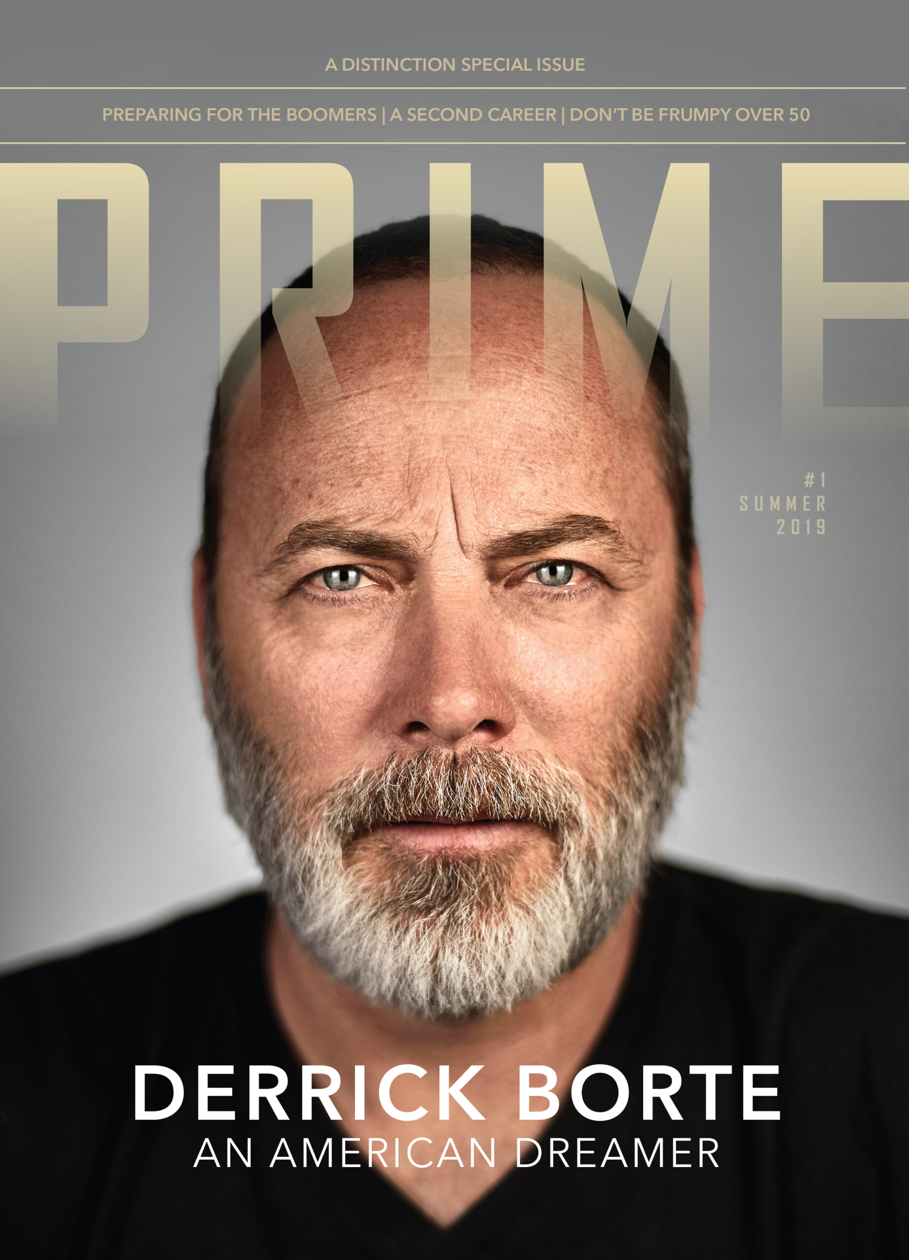
Client: Prime Magazine
With Prime Magazine’s logo and masthead, I focused on typographic refinement to give the publication a distinctive editorial presence. The treatment strengthens brand recognition while keeping the design classic and readable.
![]()
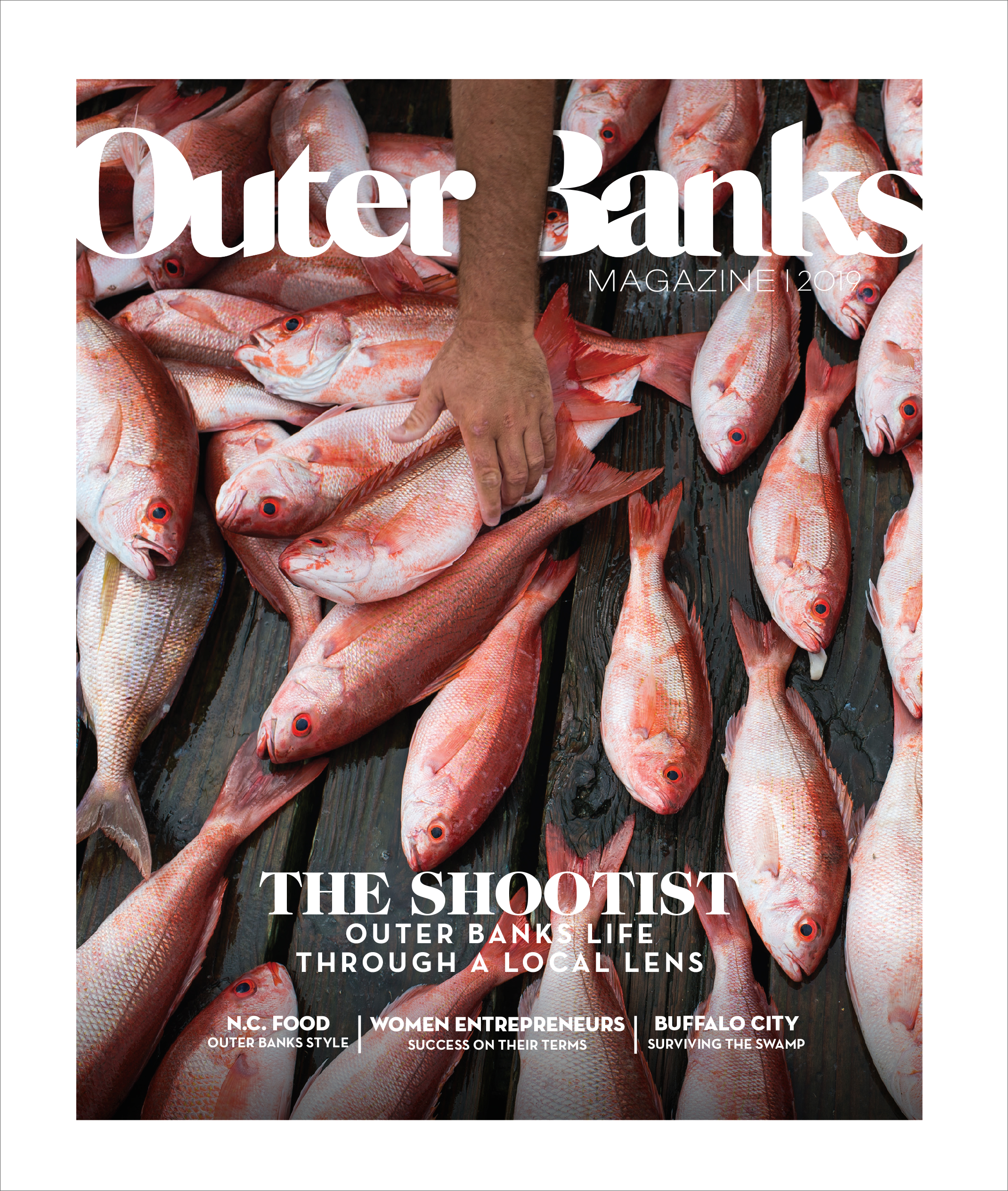
Client: Outer Banks Magazine
For Outer Banks Magazine, I manipulated a selected font to craft an identity that feels tailored to the publication’s coastal character. The custom type treatment enhances the masthead while maintaining clarity and flexibility in use.