Logo Design
Client: StarFire Festival
Developed the new logo for StarFire Festival. It’s a cosplay, video game, music festival in Norfolk Virginia. A music festival logo with a superhero aesthetic.
![]()
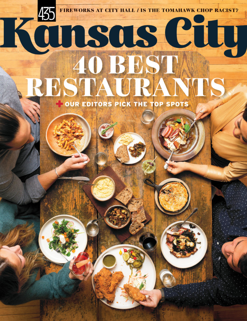
Client: Kansas City Magazine
Developed their new current logo and masthead. Augmented and stylized font.
![]()
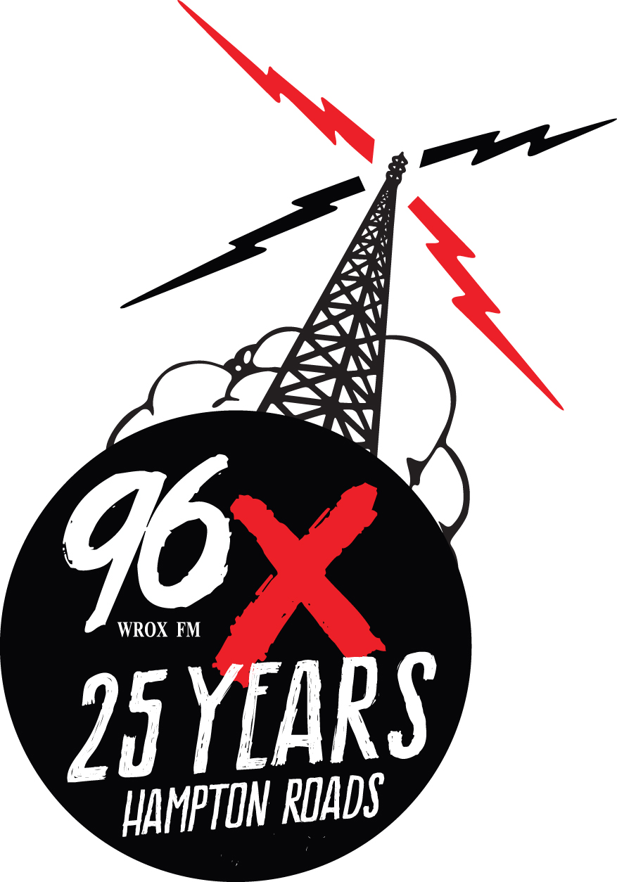
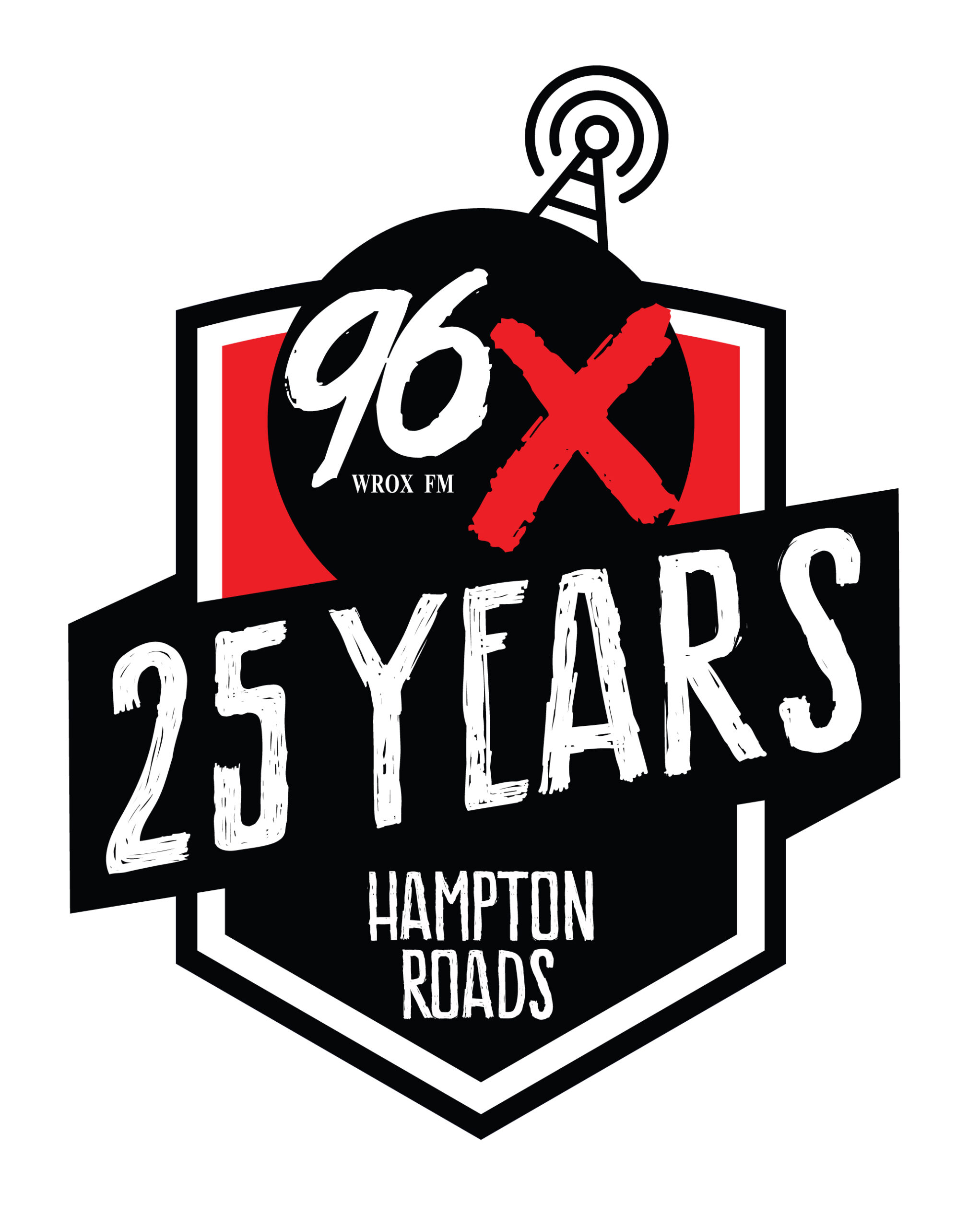
Client: 96X FM
96X wanted a 25 year Anniversary logo created. Here are three versions I developed.
They are an alternative rock station so I kept with that vibe.
![]()
Client: Droofin | Heartwork Marketing
So, I got a freelance job to redesign a logo for a local Drink Delivery company through Heartwork Marketing. Droofin delivers out of an old ice cream truck to your house. Their current logo was a little sterile. Droofin, which is Scottish for “I need a drink,” was also going to mainly focus on delivering craft beer. So, I did a little research and developed a couple of logo options, one based on a vintage beer logo look and the other on a pub-style logo that would nod to their Scottish namesake. Check it out! After a couple of rounds, still super happy with the final logo.
Their previous logo:
![]()
Their new logo I designed:
![]()
My original logo offerings before the final tweaks:
![]()
![]()
![]() Client: Belmont Eatery
Client: Belmont Eatery
The Belmont Eatery needed a logo design that reflected the history of the location and what they did. The inside of the establishment was going to have old pictures of their historic building which made them want a slightly retro and simple style of logo. They gave me their color pallet and I dove in. They were wanting to be known for their handmade sausages and hotdogs so I incorporated that in their logo as well. After many slightly different versions, we ended up here. I also designed their awning.
![]()
![]()
Client: Kinetic Life Chiropractic
Developed a new logo for this client. He wanted to have a triangle that represents the triad of health (structural, chemical, emotional). Also incorporate something that represents an active lifestyle, which is recommended and essential for optimal function. Here are my two designs, he loved them both, picked the first one.


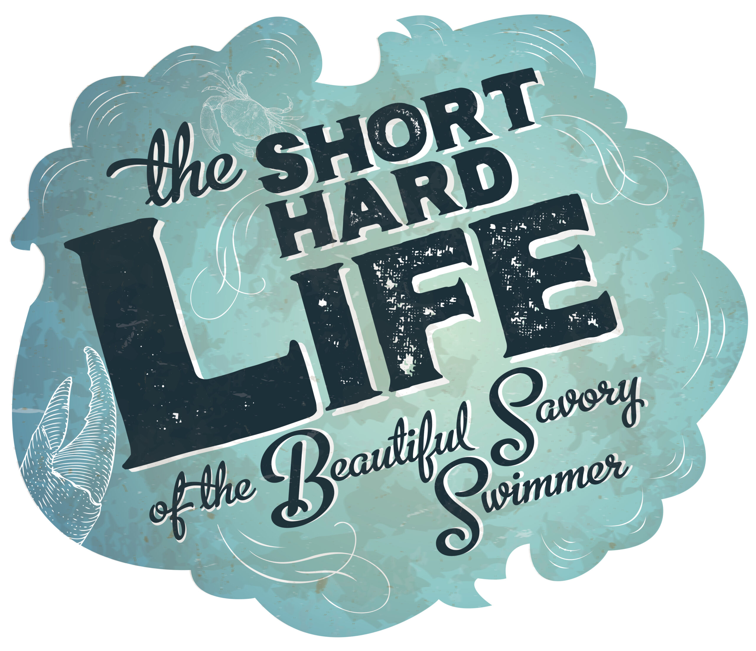
Client: Distinction Magazine
This is a headline treatment but I really loved how this came out so I decided to stick it here. It’s for an article on crabs and crabbers on Tangier Island. Font augmentation and illustration.
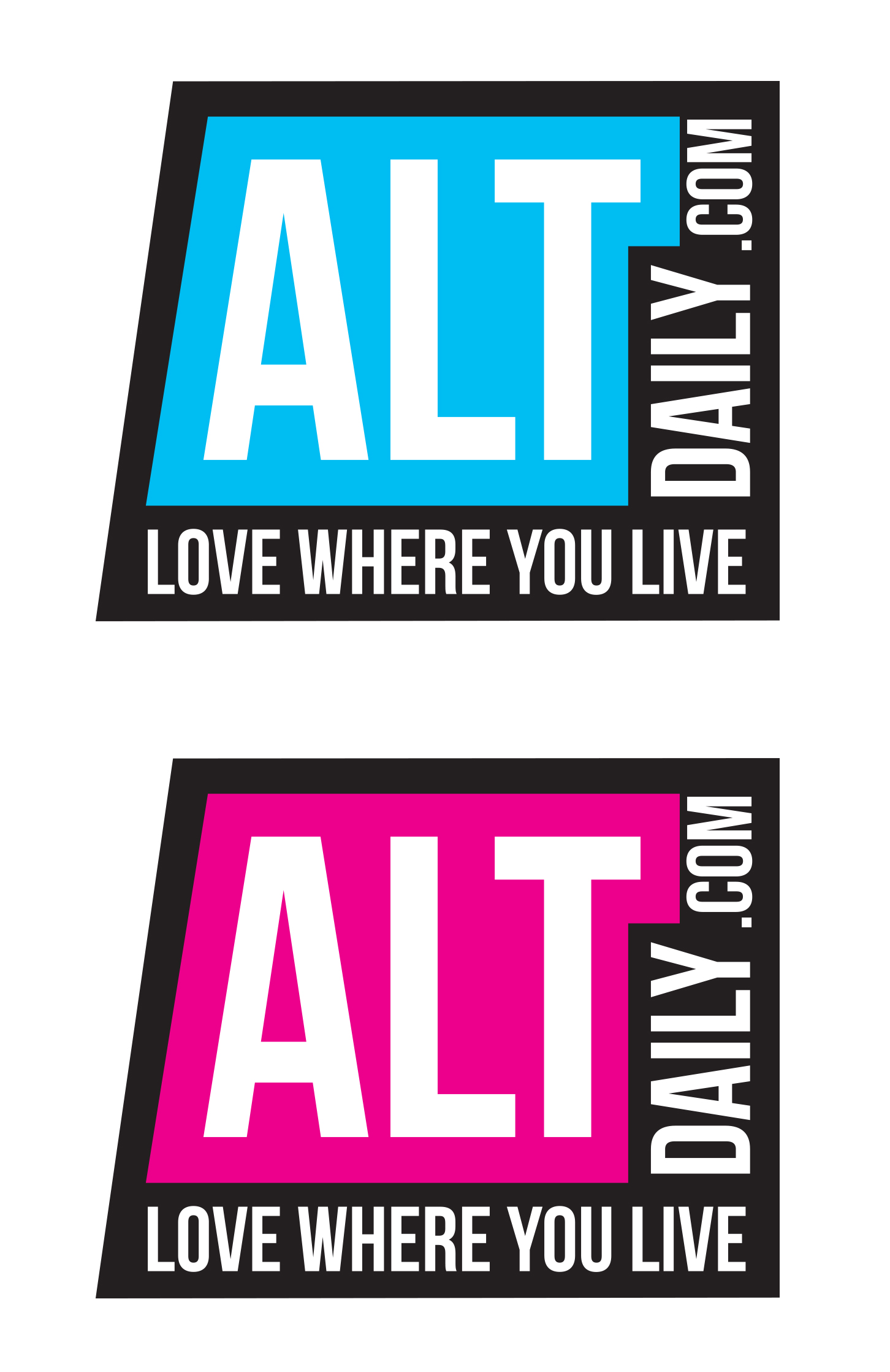
Client: AltDaily
I developed this for an online daily zine. They wanted something simple but artsy and modern. They reported mainly on arts and entertainment. They are now defunct but this was their logo for 5 years.
Client: Legends of the Fly
I developed their logo for them, based it off of a fly reel and lure.
![]()
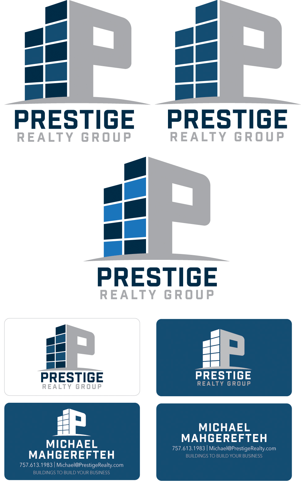
Client: Prestige Realty
Developed their new logo, they wanted something clean and a little different. Since they are a commercial realty company I incorporated a business style building look into the P of their word. They loved it and are currently using it.
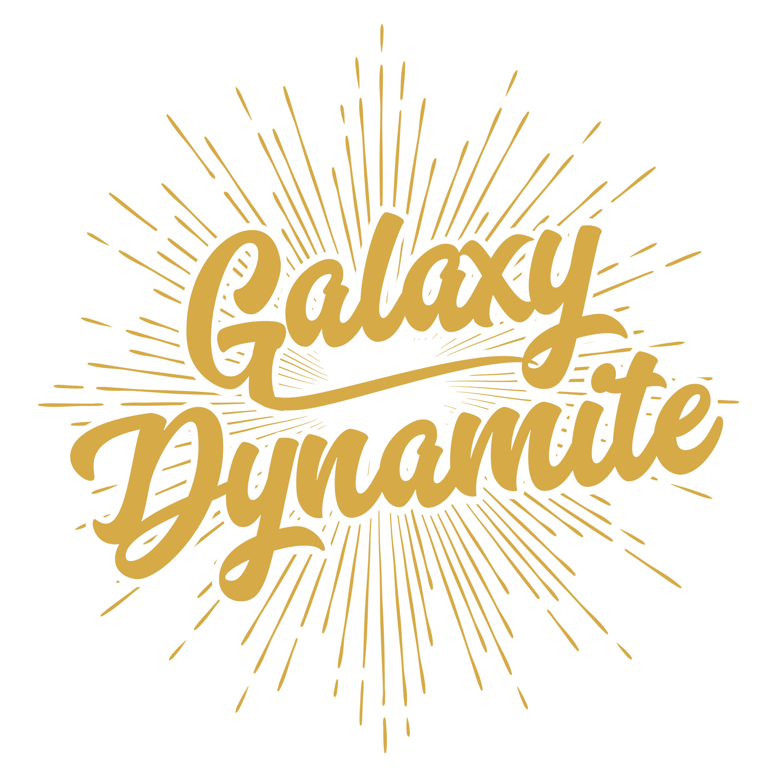
Client: Galaxy Dynamite
Developed a new logo for the band and was used on their T-shirts. Font and graphic augmentation.
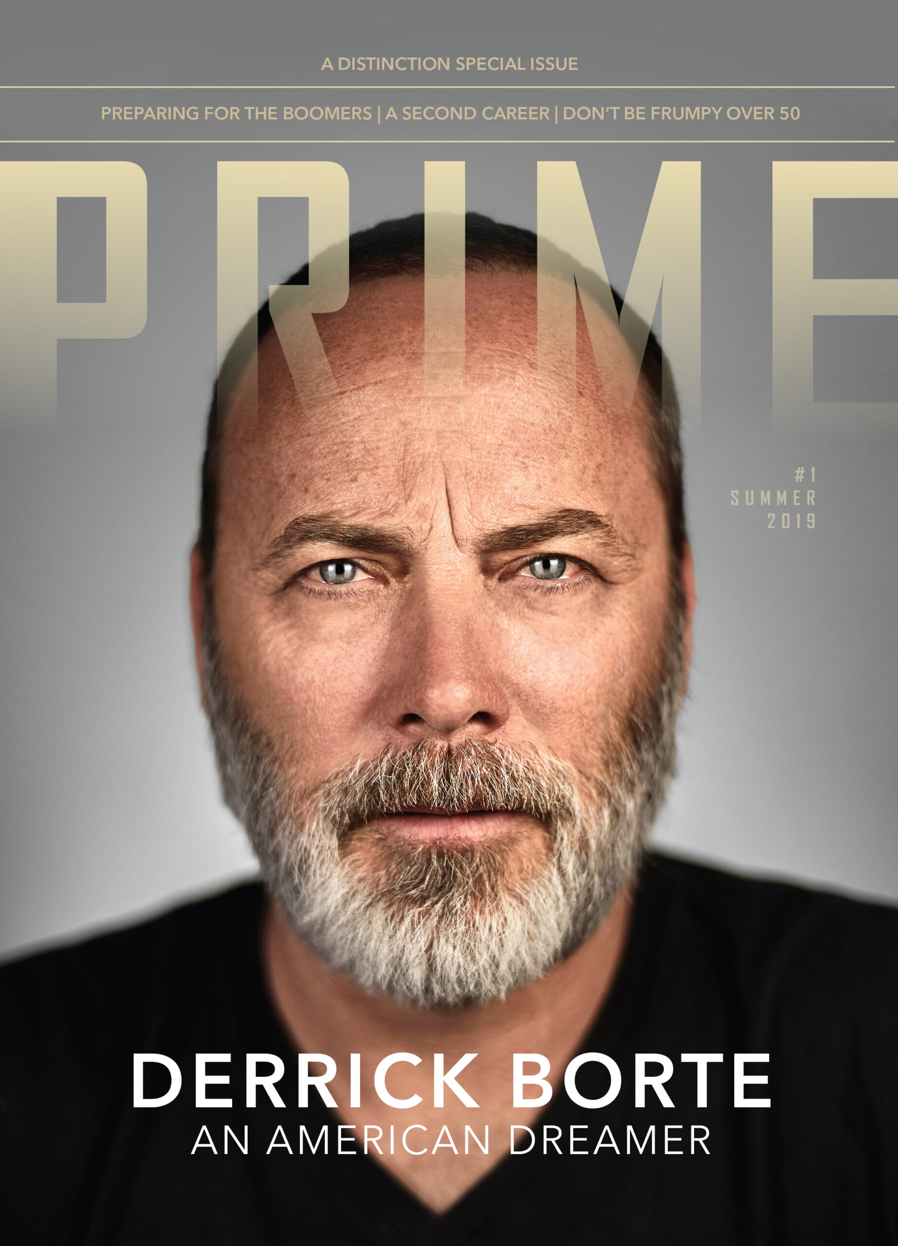
Client: Prime Magazine
Developed this logo and masthead for our product. Font augmentation.
![]()
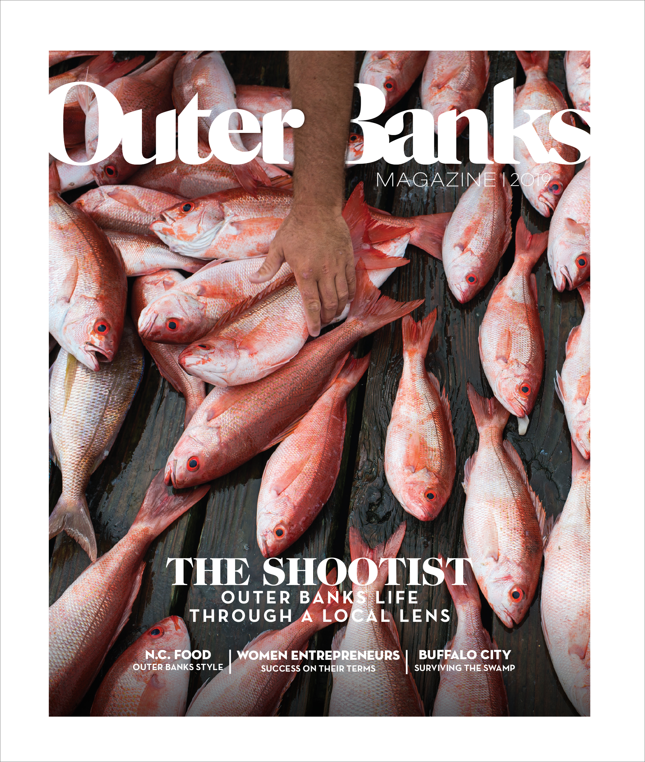
Client: Outer Banks Magazine
Manipulated a font to make this new logo for the magazine.