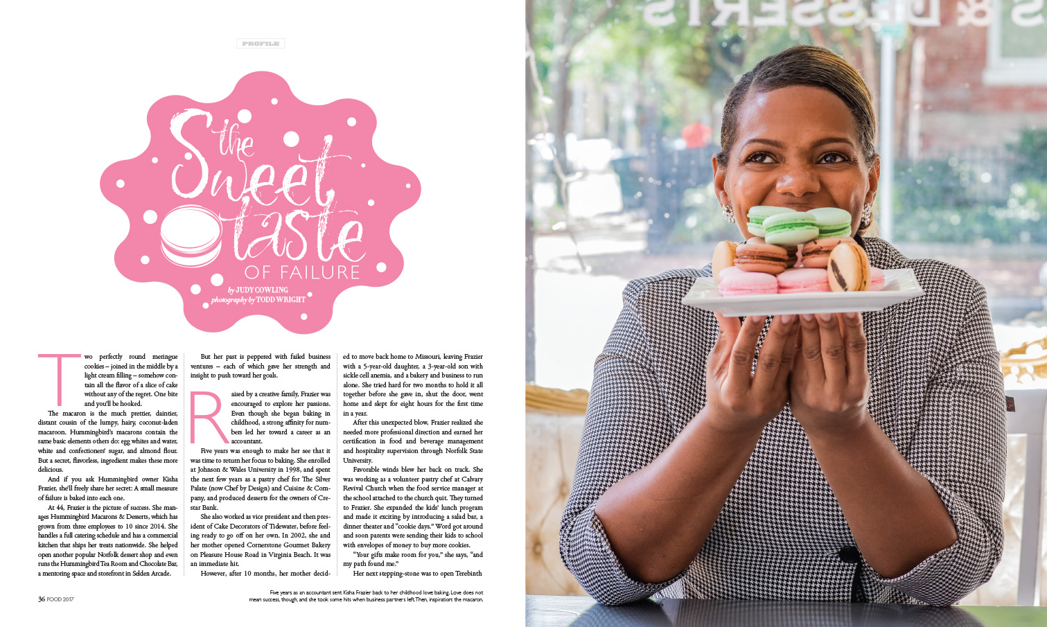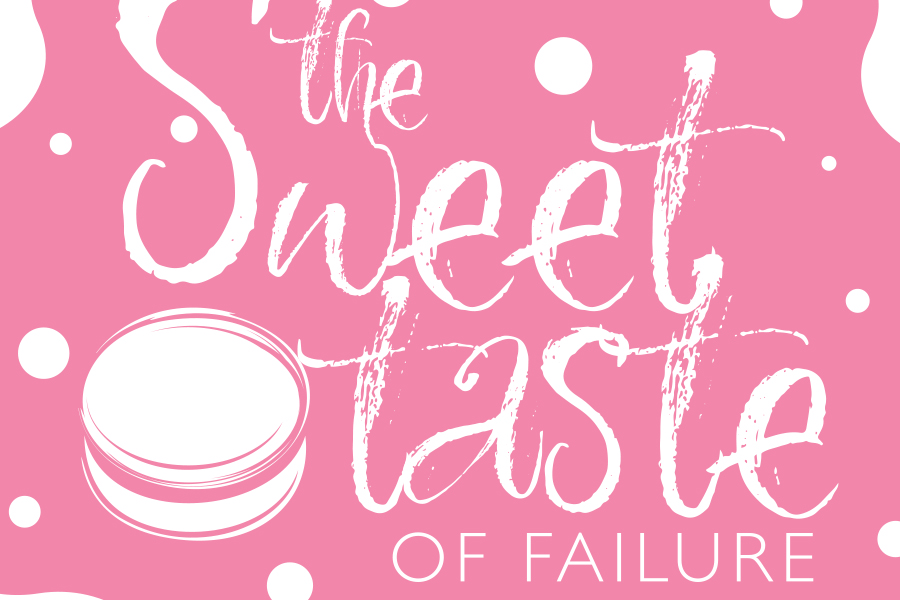
Headline Typography | Art Direction | Styling
The subject matter and the headline made me construct this shoot and headline typography due to its super sweet connotation and somewhat dark combination of phrases. The whole look of the store was super bright and cheery, as was her demeanor. I wanted to keep that feeling mostly in the headline treatment, used a nice distressed almost powdery font with “of failure” straight and to the point, but still feminine in nature. The pink blob shape was to convey confection making and I also made an illustration of a macaron to fill in space.